Stale warning
This protocol has not been updated this year! Last update was on June 28, 2022.
Histograms
Function to make subplots for several variables
# ----- PLOTTING FUNCTION -------
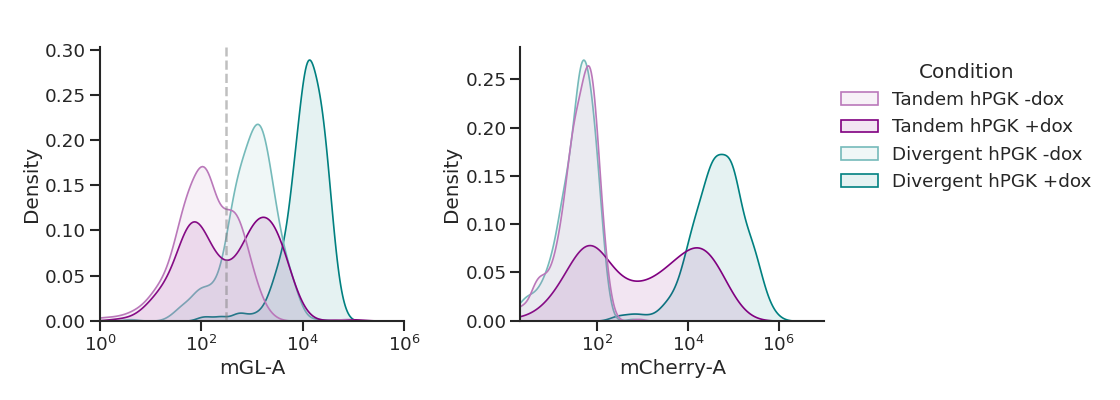
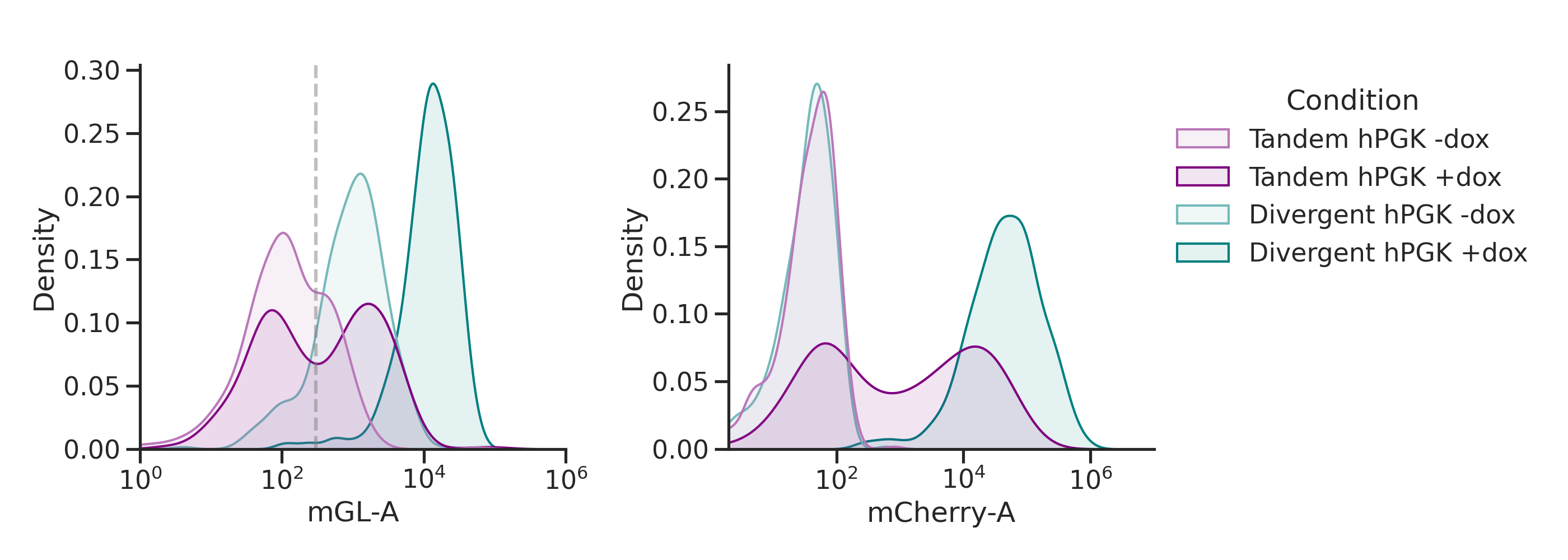
def plot_hists(df, # DataFrame with data
x, # variable (str, column header of df) or list of variables to plot
sample_list, # list of samples (values of column 'ConditionLabel') to plot in order
name, # short name (str) for saving the figure
plot_title=None, # Super-title for plot (optional str)
xlim=(1e1,1e6), # tuple or list of tuples (optional) for x-axis range on subplot(s)
gates=None # list (optional) of x-values at which to draw vertical lines, i.e. gates
):
# Specify additional parameters
lin = set(['FSC-A','FSC-H','FSC-W','SSC-A','SSC-H','SSC-W']) # list of variables to plot on linear scale (size-related params)
condition_palette = pd.read_pickle('data/histogram/exp42_palette.pkl') # custom color palette (dict mapping Condition values to colors)
sns.set_context('talk',rc={'font.family': 'sans-serif', 'font.sans-serif':['Helvetica Neue']})
sz = len(x) # number of subplots
fig, axs = plt.subplots(1,sz,figsize=(sz*7,5))
# Create each subplot
for i in range(sz):
g = sns.kdeplot(data=df, x=x[i], ax=axs[i],
hue='ConditionLabel', hue_order=sample_list, # samples are specified by the 'ConditionLabel' column in df
palette=condition_palette,
fill=True, alpha = 0.1, # shade under the curve, but faintly
log_scale=(x[i] not in lin), # default to log scale unless variable is in the linear list
legend=(i==sz-1), # add a legend only to the last subplot
common_norm=True) # supposed to normalize area under the curve (?)
# Formatting
sns.despine(ax=g) # remove top and right plot border
g.minorticks_off()
# Set the x-axis range based on provided list or value
if isinstance(xlim,list): g.set_xlim(xlim[i])
else: g.set_xlim(xlim)
# Add a vertical line (gate) if specified
if gates is not None: g.axvline(gates[i], c='gray', ls='--', alpha=0.5)
# Adjust the legend to the right of the last subplot
sns.move_legend(axs[-1], title='Condition', loc='upper left', bbox_to_anchor=(1,1), frameon=False)
# Add a super-title to the plot, if specified
fig.suptitle(plot_title)
fig.tight_layout()
# [NOT APPLICABLE HERE] Save the figure as an image to the path specified by output_path (not defined here)
# uses rushd outfile function to save metadata associated with the figure
# fig.savefig(rd.outfile(output_path/('hist-'+name+'.svg')),bbox_inches='tight')
return fig
# ----- END PLOTTING FUNCTION -------
# ----- Load data -----
labeler = pd.read_pickle('data/histogram/exp42_labeler.pkl') # dict mapping short Condition name to long ConditionLabel
data = pd.read_csv('data/histogram/exp42_data-small.csv') # stored DataFrame of data with metadata
# ----- Call the plotting function in a loop to generate plots with subsets of samples -----
# Specify variables -> this will generate two subplots
x = ['mGL-A', 'mCherry-A']
# Filter data
df = data.loc[(data[x[0]]>0) & (data[x[1]]>0)] # remove cells with log-unfriendly values
# Normalize number of cells in each sample (Condition) by downsampling to smallest sample size
num_cells = df.groupby(['Condition','Replicate'])[x[0]].count().min()
df = df.groupby(['Condition']).sample(n=num_cells, random_state=1)
# Dictionary of plots (separate figures) to generate
# keys = short name that plots are saved under
# values = list of samples (values in 'Condition' column) to include in the plot
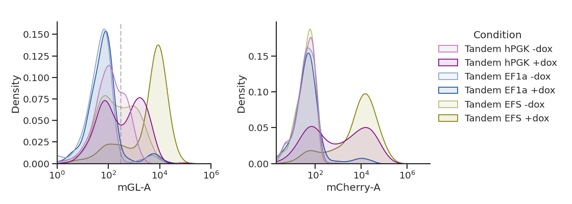
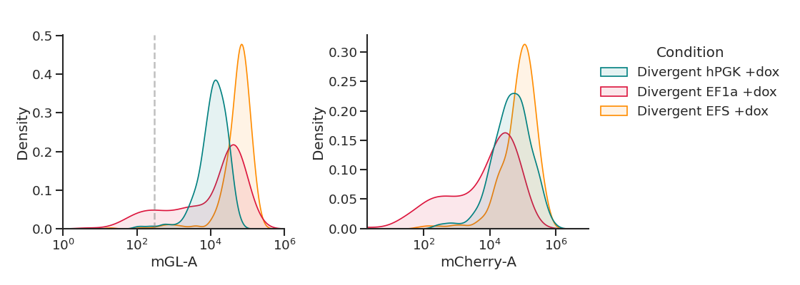
plot_list = {
'tandem': ['260_False','260_True','261_False','261_True','262_False','262_True'],
'divergent+dox': ['263_True','264_True','265_True'],
'hPGK': ['260_False','260_True','263_False','263_True'],
}
# Loop to create each plot/figure
for name, sample_list in plot_list.items():
# Convert short sample names above (Condition) to long names (ConditionLabel) -> this is particular to my df organization
sample_list = [labeler[s] for s in sample_list]
# Identify the subset of the data to plot
dd = df.loc[df['ConditionLabel'].isin(sample_list)]
plot_hists(dd, x, sample_list, name,
xlim=[(1e0,1e6),(2e0,1e7)], # specify a different x-axis range for each variable
gates=[3e2,0]) # draw a gate on the first subplot but not the second


