Stale warning
This protocol has not been updated this year! Last update was on June 28, 2022.
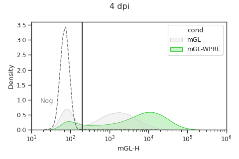
Mixed distribution + mean plots
Gating plot
# Read in data
data = pd.read_csv('data/data_mGL_WPRE/data_mGL_WPRE.csv')

# Plot mGL-H
x = 'mGL-H'
hue = 'cond'
cond_list = ['mGL', 'mGL-WPRE']
colormap = {'mGL': 'lightgrey',
            'mGL-WPRE': 'limegreen'}

# Plot
fig, ax = plt.subplots(1, 1, figsize=(6, 4))
sns.kdeplot(ax=ax, data=data, x=x, hue=hue, hue_order=cond_list,
            log_scale=(True, False), common_norm=False,
            shade=True, palette=colormap)

# Plot neg ctrl
sns.kdeplot(ax=ax, data=data.loc[data['cond'] == 'Neg'], x=x,
            log_scale=(True, False), common_norm=False,
            shade=False, color='black', alpha=0.5, linestyle='--')
ax.annotate('Neg', (0.08, 0.25),
            xycoords='axes fraction', alpha=0.5, ha='center')

# Add threshold for mGL+ gating
mGL_H_thresh = 2*10**2
ax.axvline(mGL_H_thresh, 0, 1, color='black')

# Title
plt.suptitle('4 dpi')
# Adjust limits
mGL_lim = (10, 10**6)
ax.set_xlim(mGL_lim)

# Misc plotting stuff
fig.tight_layout()  # Helps improve white spacing
plt.show()
(Source code, png, hires.png, pdf)
Box plot with well means
# Categorize if mGL+
mGL_cat = list()
for mGL_val in data['mGL-H']:
    if mGL_val > mGL_H_thresh:
        mGL_cat.append('mGL+')
    else:
        mGL_cat.append('mGL-')
data['mGL_cat'] = mGL_cat

# Get total counts and percent of mGL+ and mGL-
well_group = ['cond', 'replicate', 'sampleNum'] # specifies we're splitting by cond >> bio rep >> tech rep >> etc...
count_df = data.groupby([*well_group, 'mGL_cat'])['mGL-H'   # Doesn't have to be mGL-H, any column would work
    ].count().unstack(fill_value=0).stack().rename('count') # unstack()/stack() puts 0 if no mGL-H+ rather than dropping row
percent_df = (count_df*100/count_df.groupby(well_group).transform('sum')
    ).reset_index(name='percent')

# Extract just the mGL+ cells
data_mGL = data.loc[data['mGL_cat'] == 'mGL+']
percent_df_mGL = percent_df.loc[(percent_df['mGL_cat'] == 'mGL+')]

# Calculate geom mean of mGL+ cells
well_mGL_gmean_df = data_mGL.groupby(well_group)[
    'mGL-H'].apply(scipy.stats.gmean).reset_index(name='mGL-H (gmean)')

# Plotting parameters
x = 'cond'
y = 'mGL-H'
order = ['mGL', 'mGL-WPRE']
pairs = [('mGL', 'mGL-WPRE')]
colormap = {'mGL': 'lightgrey',
            'mGL-WPRE': 'limegreen'}

# Plot
fig, ax = plt.subplots(1, 1, figsize=(3, 3))
sns.boxplot(
    ax=ax, data=data_mGL,
    x=x, y=y, order=order,
    boxprops={'facecolor': 'None'}, showfliers=False) # Gets rid of boxplot colors and outliers
sns.stripplot(
    ax=ax, data=well_mGL_gmean_df,
    x=x, y=y+' (gmean)', order=order,
    dodge=True, palette=colormap, size=5)

# Add in stats
annot = Annotator(ax=ax, data=well_mGL_gmean_df, x=x, y=y+' (gmean)', pairs=pairs, order=order)
annot.configure(test='t-test_ind', text_format='star', loc='inside', verbose=2)
annot.apply_and_annotate()

# Adjust labels
plt.ticklabel_format(axis='y',style='sci',scilimits=(0,0))
plt.ylabel(y)
plt.title('4 dpi, HG')
fig.tight_layout()  # Helps improve white spacing
plt.show()
Violin plot with well means
# For violin plots, you must first log10 transform data
data_mGL['log({})'.format(y)] = np.log10(data_mGL[y])
well_mGL_gmean_df['log({})'.format(y+' (gmean)')] = np.log10(well_mGL_gmean_df[y+' (gmean)'])

# Plot
fig, ax = plt.subplots(1, 1, figsize=(3, 3))
# Plot all points as violin
sns.violinplot(
    ax=ax, data=data_mGL,
    x=x, y='log({})'.format(y), order=order,
    palette=colormap, inner="quartile")
# Plot log10 transformed -> well geometric means of mGL-A as points
sns.stripplot(
    ax=ax, data=well_mGL_gmean_df,
    x=x, y='log({})'.format(y+' (gmean)'), order=order,
    dodge=True, color='white', size=5)

# Make log axis label:
ax.yaxis.set_major_formatter(
    mticker.StrMethodFormatter("$10^{{{x:.0f}}}$"))
ax.yaxis.set_ticks(
    [np.log10(x) for p in range(1, 7) for x in np.linspace(10**p, 10**(p+1), 10)],
    minor=True);

# Add in stats
annot = Annotator(ax=ax, data=well_mGL_gmean_df, x=x, y=y+' (gmean)', pairs=pairs, order=order)
annot.configure(test='t-test_ind', text_format='star', loc='inside', verbose=2)
annot.apply_test().annotate(line_offset_to_group=0.3) # Offset helps account for height of violin

# Adjust labels
plt.ylabel(y)
plt.title('4 dpi, HG')
fig.tight_layout()  # Helps improve white spacing
plt.show()